Clarity before decoration
Visitors should understand what a business does before they admire the design.
 “This earned my trust immediately.”Video testimonial · Christianne Zurowski
Ojo Israel Ayomide Website Strategist & Designer
I design and build strategic websites for coaches, consultants, therapists and service-based businesses that need more than just a good-looking website.
I combine strategy, user experience, design and development to create clearer digital experiences, so visitors understand what you do and know what to do next.


 Ojo Israel AyomideWebsite Strategist & Designer
The problem
Plenty of business websites look fine and still communicate poorly. The visitor lands, scans, and quietly leaves with a few questions unanswered.
Who the site is for, what it must say and what should happen next.
The order of pages and sections, so the message arrives in the right sequence.
The visual and interactive layer that makes the path easy to follow.
A fast, responsive site that works the way it was planned.
Principles
Visitors should understand what a business does before they admire the design.
A good website should guide people, not simply give them information.
The website should reflect the quality of the person or company behind it.
Portfolio
Two projects. One is real client work. The other is a concept, and it is labelled as one.
Client Work
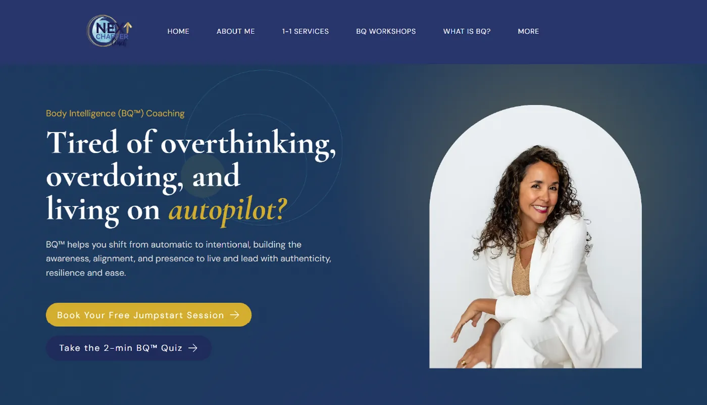
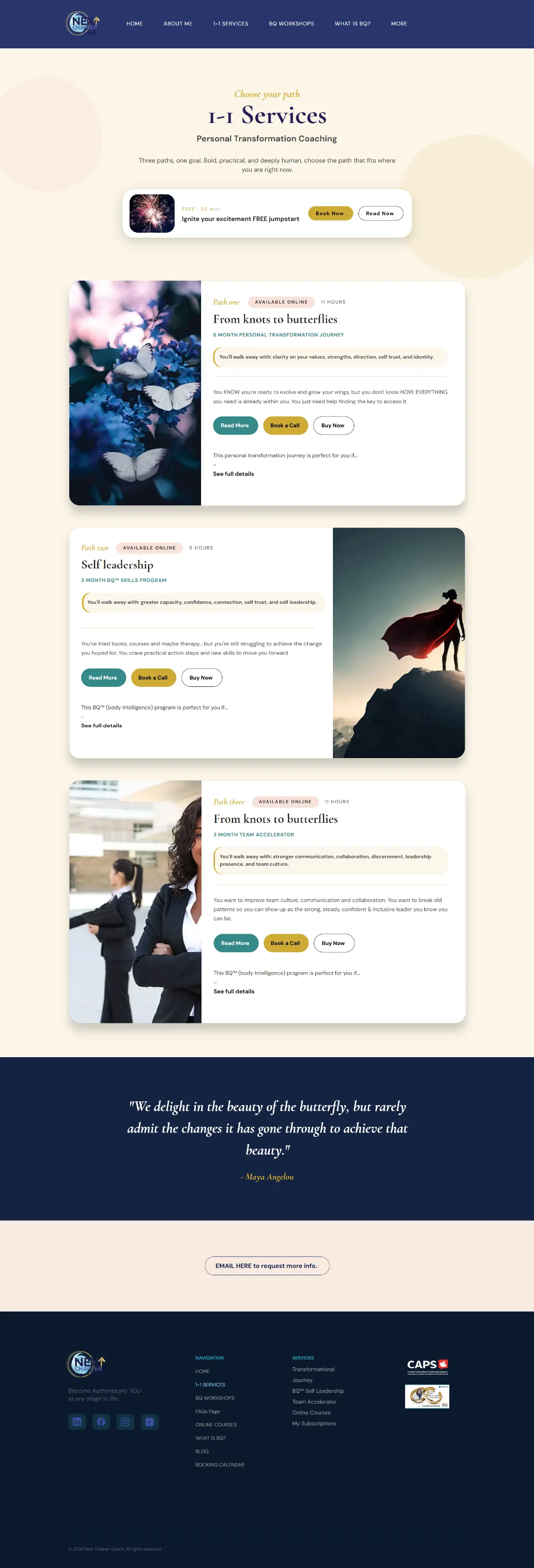
Website redesign for Christianne Zurowski, an embodiment coach. Five key pages made clearer, more structured and easier to move through.
Concept Work
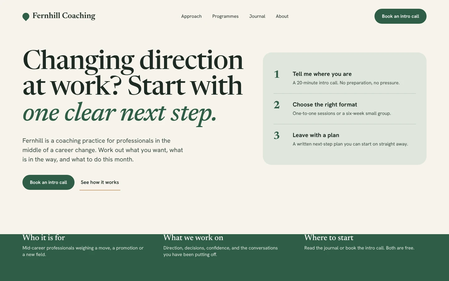
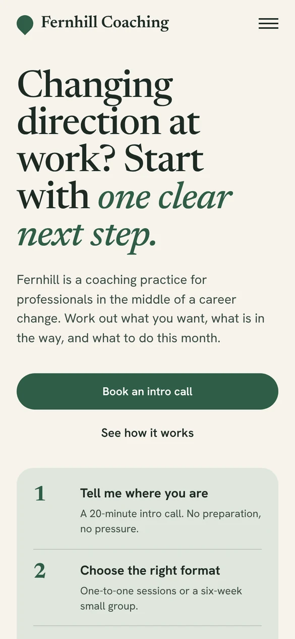
A website concept for a fictional career-transition coach, built to show how I approach positioning, structure and calls to action.
Featured case study
I connected with Christianne through targeted email outreach after noticing opportunities to improve the clarity and user experience of her existing website. Rather than sending a generic pitch, I shared a few specific observations about the site and how the experience could better communicate her work and guide visitors. That conversation led to us working together on five key pages of the website.
Christianne already had a strong body of work, a distinct coaching approach and valuable content. The opportunity was to make the selected pages clearer, more structured and easier for visitors to understand and navigate.
I worked through each page by asking what a first-time visitor needs to understand, and in what order. These were the areas I focused on.
The five redesigned pages. Scroll inside the frame to read the full page, or open it at full size.

Scroll inside the frame. These are the redesigned pages only. No before version is shown.
The result is visible in the pages themselves. I have not attached figures to it.
What it was like working together
Video testimonial
I could tell he had actually read over my website and understood my work at a deeper level. This earned my trust immediately.
“Israel is thorough, thoughtful and an excellent listener - key components for a good creative hire. Unlike the many people who have pitched me generic content upgrades for my website, he captured my attention from his first email outreach. I could tell he had actually read over my website and understood my work at a deeper level. This earned my trust immediately. After that, working with him was just as lovely. He is prompt to respond and able to hear and apply my content ideas in a very timely fashion. All of his communication was respectful and professional and he was able to improve my website immensely. My graphic designer friend here in Canada was also impressed with his work - she said it flowed really well and was very clear and inviting for the user (unlike the version I had created myself :). I appreciate Israel as a good human and as a talented web designer and highly recommend him to anyone who has struggled to turn over their brand to people they feel don't quite understand them - you will feel seen, heard and supported.”
Christianne Zurowski, Next Chapter Coach
How I work
Understand the business, audience, existing website and goals.
Clarify the message, user flow, content hierarchy and page structure.
Turn the strategy into a polished website experience.
Make sure the final experience works across devices and feels aligned with the business.
Clarifying the purpose, structure and direction of the website.
Creating a clear visual experience and user flow.
Turning the strategy and design into a functional website.
Improving an existing website where the structure, clarity or experience needs work.

About
I’m Ojo Israel Ayomide, a website strategist and designer. I care about more than how a website looks.
When I open a business’s website, I ask a few plain questions. What is unclear? What is getting in the way? What does the visitor need? What should happen next? Then I work out how structure, design and experience can answer them, and I build the solution.
That means thinking about:
A website concept for a fictional career-transition coach. It shows how I think about positioning, structure, user flow and calls to action.
Career coaches often sound alike. The brief I set was to make this practice clear within five seconds, and to give someone in the middle of a change an easy first step.
One audience: mid-career professionals changing direction. One promise: one clear next step. One main action: an intro call. Proof sections would use real client stories once they exist, so none are invented here.
Warm paper, deep moss green and a serif voice, to feel calm and human. Generous spacing, no stock photography, and a single accent for actions.
One H1 per page, descriptive page titles, clean URLs and internal links from the journal to the programmes.
/
/approach
/programmes
  /programmes/one-to-one
  /programmes/small-group
/journal
/about
/intro-call
Fernhill Coaching is a fictional business created to demonstrate my approach. It is not a real client project, and nothing here represents real results.
Insights
Good design earns attention. It does not guarantee understanding.
ReadA homepage is a decision point, not a summary of everything you do.
ReadThe questions I ask, in the order I ask them.
ReadA quick check
Answer five questions about your own site. Your answers light up a path on the right.
Can visitors understand what you do quickly?
Is your offer clear?
Is the next step obvious?
Does the page flow naturally?
Does the website reflect the quality of your business?
FAQ
If your website doesn’t clearly communicate your value or guide visitors toward the next step, let’s improve the experience.